SaaS Integration Guide
1Password
AKASHI
AWS IAM Identity Center
Acall
Active! gate SS
Adobe CC (Enterprise plan)
AirCourse
Airtable
Amazon Business
Amazon Web Services (AWS)
Amplitude
Amptalk
App Store Connect
AppFigures
AppsFlyer
Asana
Ashita_cloud
Atlassian
Autodesk(Suspended)
Awesome Screenshot
Backlog
BambooHR
Basecamp
Bitbucket
Bitdefender
Bitrise
Bitwarden
Biz Storage fileshare
BlazeMeter
Board
Box
Brabio!
Businessmap
Cacoo
Calendly
Call Connect
Canny
Canva
Channel
ChatGPT for teams
Chatwork
Cisco Meraki
ClickUp
Clip Studio
Cloud CIRCUS
Cloud Campus
Cloud sign
Cloudflare
Codecov
Collaboflow
Confluence
Contentful
ContractS CLM
Coopel
Create! Web Flow
Crowdstrike
Cybermail
Cybozu
Datadog
DatoCMS
DeepL
DeployGate
Dialpad
DirectCloud
Discord
DocSend
Docbase
Docker
DocuSign
Domo
Drata
Dropbox Business
Dropbox Sign
Elastic Cloud
Esa
Exment
Expensify
FastAnswer2
Fastly
Figma
Flyle
Fontworks
Formrun
Formspree
Freshchat
Freshdesk
Freshservice
GMO Sign
Garoon
Gather
Ghost
GigaCC
GitHub
GitKraken
GitLab
Google Cloud Platform
Google Drive with Service Account
Google Play Console
Google Tag Manager
Google Workspace
HENNGE One
HERP Hire
HRBrain Talent Management
HRMOS Talent Management
HRMOS adopts
HRMOS diligence and indolence
HackMD
HaloPSA
Heap
Heroku
Honeybadger
Honeycomb
HotProfile
HubSpot
Hubble
Huntress
ISM CloudOne
InVision
Intercom
Jamf
JetBrains
Jinger
Job Can Recruitment Management
Job Kan Attendance Management
Job Kan Labor HR
KARTE
KING OF TIME
Kamon
Kaonavi
Keeper Enterprise
Kibela
Kincone
Kintone (Japanese version)
LINE WORKS (OAuth linkage)
Lanscope Endpoint Manager
Lanscope Endpoint Manager (Device)
Lastpass
Linear
List of supported SaaS
Looker
Loom
Lucidchart
Lumin
Lychee Redmine
MAJOR FLOW Z
Mackerel
Mail Dealer
Mailtrap
Marketo Engage
Mekari Journal
Meta Ads Manager
Metabase
MicroCMS
Microsoft 365
Microsoft Entra ID (Azure AD)
Microsoft Intune
Microsoft Teams
MiiTel
Miro
Money Forward Admina
Money Forward Cloud Accounting
Money Forward Cloud Accounting Plus
Money Forward Cloud Accounting Plus (Cost Data)
Money Forward Cloud Agreement
Money Forward Cloud Attendance
Money Forward Cloud Expense
Money Forward Cloud Fixed Assets
Money Forward Cloud Human Resources Management
Money Forward Cloud Invoice
Money Forward Cloud Payroll
Money Forward Cloud payable
Money Forward Pay for Business
Mural
My Redmine
NEXT ENGINE
NI Collabo 360
Netlify
Netsuite
New Relic
NinjaMock
NinjaOne RMM
NotePM
Notion
Okta
OneDrive
Onelogin
OpenAI Platform
Openlogi
OpsRamp
Overflow
PHONE APPLI PEOPLE
PagerDuty
Percy
Pipedrive
Postman
Productboard
ProtoPie
Quantive
Quay
Questetra
Quickbooks
Rakuro
Re:lation
Receptionist
Recruitment batch Kanrikun
Redash
Reftab
Rollbar
SECURE DELIVER
Salesforce
Sansan
Save Point
Seculio
SecureNavi
SendGrid
Sentry
ServiceNow
Shopify
Signavio
Site24x7
Sketch
Slack
Slido
Smaregi Time Card
SmartHR
Smartsheet
Snowflake
Snyk
Soliton OneGate
SonarCloud
Soracom
Splashtop Enterprise
Square
Studio
Sumareji
TOYOKUMO Safety Confirmation Service 2
Tableau
Tailscale
Tally
Tareru Dokodemo Cabinet
Tayori
TeamGantt
TeamSpirit
TeamViewer
Teamwork
Terraform Cloud
TimeCrowd
Todoist
Toggl track
TrackJS
Transifex
Trello
Trimble
Trust Login by GMO
Twilio
Typeform
Unipos
Unity
Valimail
Vercel
Vimeo
Wantedly
Webex by CISCO
Webflow
Whimsical
Wistia
WithSecure
Wix
Wordpress
Wordpress self-host (API)
Workable
Workplace from Meta
Wrike
Xero
YarakuZen
Yayoi My Portal
Yoom
YouCanBook.me
Zaico
Zapier
Zendesk
Zenhub
Zeplin
Zoho CRM
Zoho People
Zoom
bakuraku series
dbt Cloud
direct
fondesk
freee HR
freee accounting
freee sign (formerly NINJA SIGN)
hotjar
invox
job can payroll
job can workflow
kickflow
kintone (global version)
monday.com
oVice
oplus
raku raku sales
smartround
trocco
workhub
What's New
Tutorial
0. Getting Started
1. Account Creation and Initialization
2. Set up the domain and link with employee master data
3. Cost Management Setup
4. Integrating SaaS
5. Setup Billing
SaaS Management
Billing
Check SaaS license status
Custom Apps(Manual Integration)
How can I learn more about how to work with cloud services?
How to link cloud services managed by other business divisions and departments?
Integration Log Function
Inviting other users
Need to stop the integrated service
Request an unsupported SaaS or feature to be added
Troubleshooting failed integrations
User Type Judgment Criteria: Quick Reference
[Event Log] Check SaaS usage
Shadow IT
Admina Browser Extention for Microsoft Edge
How to setup Admina Browser Extension
Shadow IT Detection
The detail of Shadow IT detection
Account Management
About alert types
Account Provisioning (register a new SaaS account)
Export account data
What is Last Activity
[Directory]Admin Directory
Employee Off-Boarding
Alert Mute
Delete/deactivate an account in the Admina by Money Forward
Do you have a retired account left?
Manage former employee accounts (Employee offboarding)
Note on possible data loss when deleting a cloud service account
Retired account export
Slack Notification Settings
Cost Management
Analyze the cost situation (Insight)
Check the payment status of SaaS
Cost Management with CSV Data
Manage SaaS contract dates
Manage SaaS invoices and receipts
Use cost management β
Manage public files
External Shared Content Management Functions
[Google Drive] Specify the conditions for detecting files
[Safelist] Exclude detected files
Device Management
Device features FAQ
How to create a device ledger CSV for import
List of management items
Use device functions
FAQ
Can I use two-factor authentication (2FA) to log into Money Forward Admina?
Deleted users in Google Analytics remain in Money Forward Admina
How to get an account with Jira, Confluence, Trello, etc.
How to invite Admina operators
I want to change my Money Forward Admina login password
If you link with the Money Forward Cloud Series, you will receive a security notification email
Integration procedures when 2FA (two-factor authentication) is enabled
New Admina Role
To change your Money Forward Admina billing address
User name display (acquisition criteria)
What happens if the person who linked the cloud service retires?
What if IP address restrictions are applied on the SaaS side?
[Integration Error] Authentication error occurs when login using Google Authentication or SSO.
Others
Table of Contents
- All Categories
- Cost Management
- Analyze the cost situation (Insight)
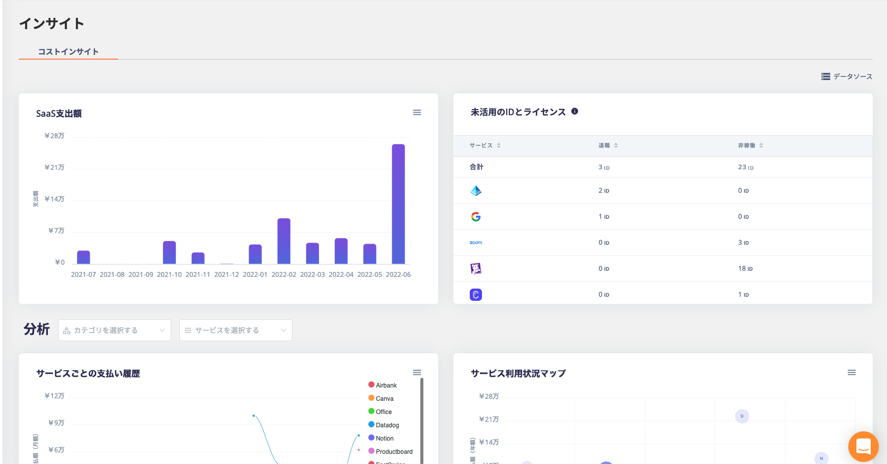
Analyze the cost situation (Insight)
Analyze cost insights
This page explains "Insight".
It is possible to visualize and analyze the usage status of SaaS so far.
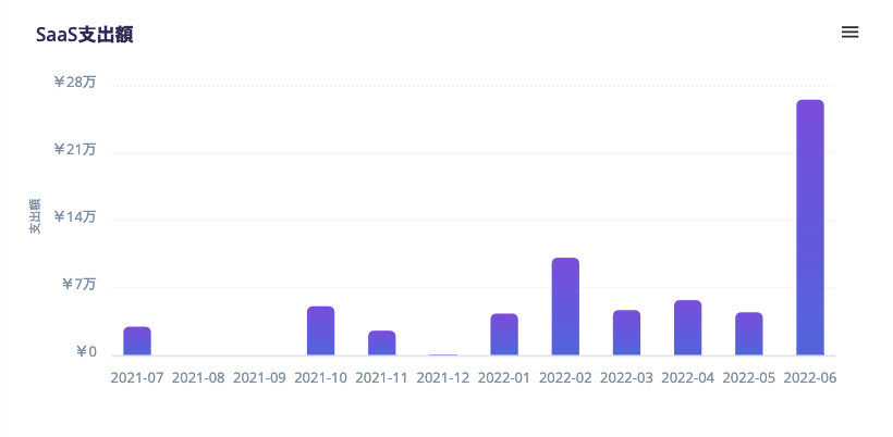
Graph display of SaaS spending
The cumulative spending amount of SaaS is displayed as a bar graph. The display period is one year.
Unused IDs and licenses
The IDs and licenses that may lead to cost reduction by deleting are displayed.
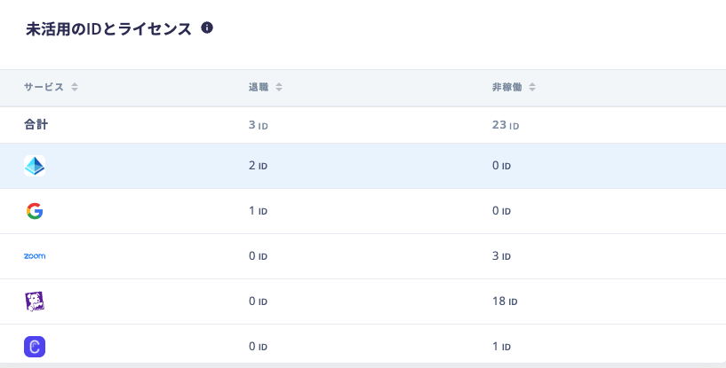
- Termination: The number of retirement accounts. (Matches the number of service alerts.)
- Non-operation: Shows the number of accounts that have not logged in for 45 days or more.
(Chrome extension distribution is required to get all non-working IDs)
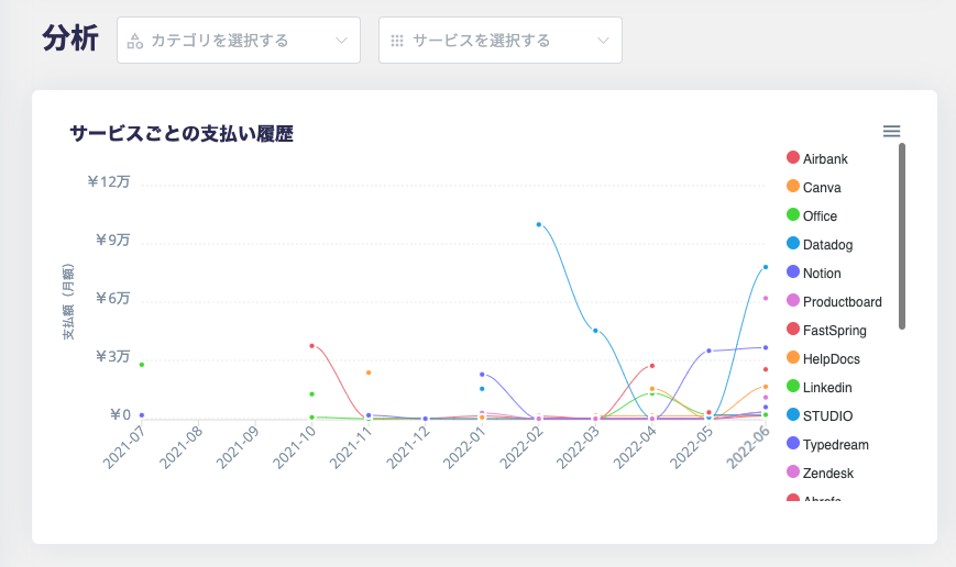
View payment information for each service
The payment status for each SaaS is displayed in a graph. It is also possible to display by SaaS unit or category unit.
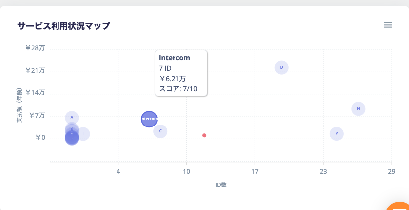
Service usage map
- Vertical axis: SaaS payment amount (annual amount).
- Horizontal axis: The number of SaaS usage IDs.
- Circle size: The larger the circle, the greater the room for cost reduction in SaaS.